Webcraft Artwork / Case Study
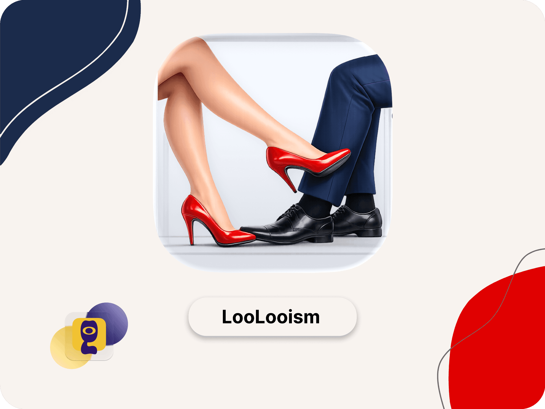
LooLooism
We designed LooLooism as a dating platform for atheists and non-religious users who want a more aligned space for meeting people. The experience needed to feel welcoming and modern, while giving profiles, values, and compatibility enough structure to support more meaningful connections.
Artistic Introduction
A dating experience shaped around worldview compatibility, not generic swiping.
We approached LooLooism as a product with a very specific community need. Users are not only looking for attraction or proximity, they are also looking for alignment in values, identity, and lifestyle.
That meant designing a clearer profile rhythm, a more intentional discovery flow, and a softer interface tone that encourages trust without flattening the product into another generic dating app.
What We Designed
Three decisions shaped the experience.
Values-Led Discovery
Profiles and browsing flow were designed to surface compatibility earlier, not bury it behind shallow first impressions.
Warm, Credible Tone
The interface balances openness and professionalism so the platform feels safe, current, and distinct from generic dating templates.
Clearer Connection Paths
Navigation and profile structure help users move from curiosity to conversation with less friction.
Responsive Experience
Built for profile browsing and conversation starts on mobile.
Dating products live on small screens, so LooLooism needed a mobile-first structure from the start. We kept profile signals, compatibility cues, and action points visible without crowding the interface or making browsing feel rushed.
Fast profile scan
Users can understand compatibility and identity faster without opening every detail layer.
Comfortable interaction flow
Key actions stay obvious and touch friendly across smaller breakpoints.
Community-specific clarity
The product feels made for its audience instead of acting like a generic dating clone.
Outcome
A case study that presents LooLooism as community-specific product design.
The result is a stronger portfolio presentation for LooLooism: clearer framing of the audience problem, better explanation of the dating-product UX choices, and a direct route from the case study into the live platform.